• PORTFOLIO
  • CLIENTS
  • About
  • Blog
  • CONTACT
  • PHILOSOPHY
Mauk Design

Independent Exhibit Design Consultancy

  • PORTFOLIO
  • CLIENTS
  • About
  • Blog
  • CONTACT
  • PHILOSOPHY

Exhibiting in a Ballroom?

In the course of creating exhibition design, the hotel ballroom venue poses unique challenges. Just like a trade show hall but with carpet, right? Not really.   

The expectations of the client are usually to create an exhibit that is just like the trade show exhibit on the floor of the convention center hall. While there are some similarities, it’s a really different space in which to communicate a message.

A site survey is the place to start. This is critical because unlike standard trade show floor spaces, every ballroom is different. There is almost always overly designed carpet, elaborate wall detailing, low ceiling height, columns and chandeliers.

Hotel carpet can overshadow your message.

Hotel carpet can overshadow your message.

Most hotels have fairly complete CAD documents, but double check critical dimensions so you have a firm idea of the space. Pay attention to chandeliers that descend below the average room height. Nothing worse than setting up a 13’ tower in a 14’ room, only to discover an immovable chandelier that descends to 12’. I’ve found that these rooms always look taller than they actually are, so measure twice.

Carpet in ballrooms is designed to stand out in a massive room, and the aggressive pattern can be really distracting in a smaller space. At minimum, plan to carpet your space so that your exhibit can stand out against the ballroom carpeting. A neutral carpet works best unless you have a flooring that ties into the exhibit concept like a printed beach carpet for a sunscreen product. 

If you have any control of the hall lighting, turning off the chandeliers and ambient lighting reduces the forced “fanciness” of the environment. This will require you to bring your own lighting, but it can also allow your exhibit to really stand out against the competition using the existing hall lighting. 

Setup access can be another problematic issue. Unlike convention center exhibition halls, hotels are primarily setup for people, not properties. The path to bring in exhibit properties can be lengthy. I recently did an exhibit that required using a single loading dock (which we had to share), two small elevators and a long convoluted path to bring in our exhibits. This added to substantially to labor costs.

Keeping fire exits accessible is critical in laying out any space, but especially in a ballroom. Talk to the fire marshall about the preferred exits before you start designing. You may find out they might require fewer doors than are available.  For design purposes, I always assume that every exit needs to be left open. Fire sprinklers also need to be left unobstructed. This will limit or eliminate covered exhibit spaces such as conference rooms. 

There can also be lower limits to utilities in the ballrooms. Wifi speeds, and electrical capacity are generally much lower than on a convention hall floor. One advantage of ballrooms is that wifi dependent live demonstrations sometimes work better because they don’t need to compete with the anarchy of wifi signals in a convention hall. The hotels’ event coordinator will be your best source for this kind of information.

In the end, the great thing about doing a large exhibit in a dedicated hotel ballroom is that you have total control of the space. You don’t have to compete for attention with your competitors, which allows for a clear and focused message. 

Good luck, and I look forward to your comments.

Mitchell Mauk

Monday 11.18.19
Posted by mitchell mauk
Comments: 1
 

Exhibit Design: Using Color to Stand Out

One of the most overlooked tools in an exhibit designers box is color. Walking the convention halls you’ll notice most exhibits are white with blue or red accents. It’s hard to convince an attendee that your product is unique or innovative if your exhibit is the same color as all your competitors. The result is attendee fatigue.

Fortunately there are more than two colors! Start by looking for colors that communicate your message. Environmental message? Try green. Speed? Red’s an option. Tech? Blue can work. Most of these colors come with considerations.

Green in a tech show will be dramatically more visible than a red or blue exhibit, because fewer tech firms have a green message or green corporate colors. 

Clover Diary-Popup Store

Clover Diary-Popup Store

Some colors need special handling. Bright red tends to die under the sodium halide or mercury vapor lights that illuminate the halls. The solution is to use brightly lit backlit red, which overpowers the hall lights.

Doing a yellow exhibit? It should look as if it has been submerged in yellow paint. Yellow furniture, yellow desks, yellow graphics, yellow everything. Or use black as a background for the yellow color.

McDonald’s World Wide Conference-Operations Exhibit

McDonald’s World Wide Conference-Operations Exhibit

It’s commonly thought that an exhibit needs to utilize the primary corporate color of the company. Because many corporations share similar corporate colors, this leads to exhibits that blend into their competitors. A better solution is to choose a color that helps communicate the message. 

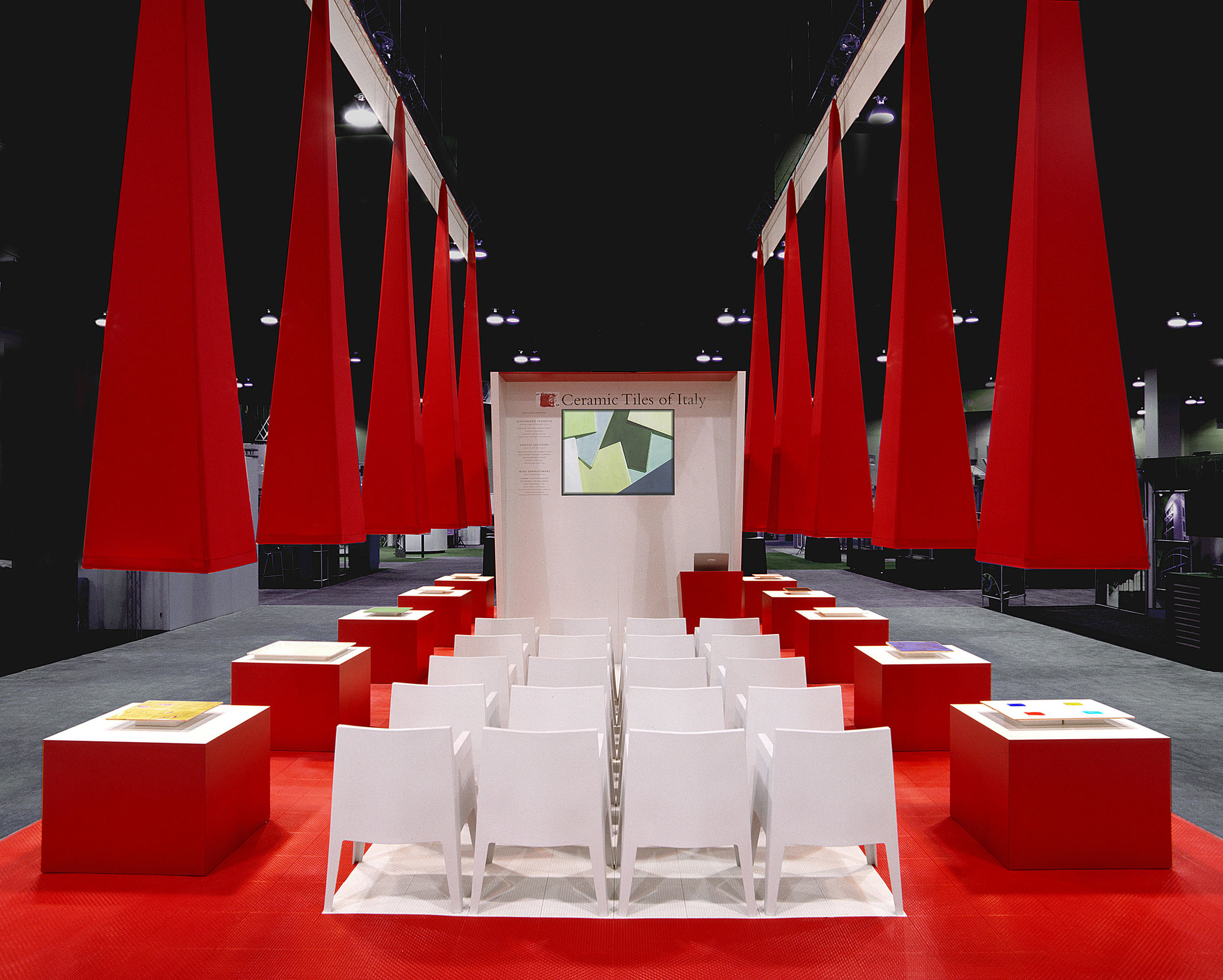
In designing an exhibit for Ceramic Tiles of Italy we presented an entirely red exhibit. They asked “why was it red?” I thought it was obvious, but answered “It’s red like the Italian flag or red like a Ferrari”. Their eyes lit up. “That’s great! Given the fact that most ceramic tile factories in Italy surround the Ferrari factory, it worked. They bleed Ferrari red, and they were ecstatic with the result. More importantly, they were thrilled with their booth traffic.

Ceramic Tiles of Italy-American Institute of Architects Conference

Ceramic Tiles of Italy-American Institute of Architects Conference

White can stand out in the exhibit space, if done properly. It’s as if you put the clients product on a white backdrop for a photo shoot. The key is to pull all of the clutter out of the design. Only the essential products or communication should be visible. In a white exhibit, even the trashcans are going to call attention to themselves, so they need to be amazing trashcans. As with all exhibits, lighting a white exhibit is even more critical to separating your exhibit from the competition.

McDonald’s World Wide Conference-Futures Exhibit

McDonald’s World Wide Conference-Futures Exhibit

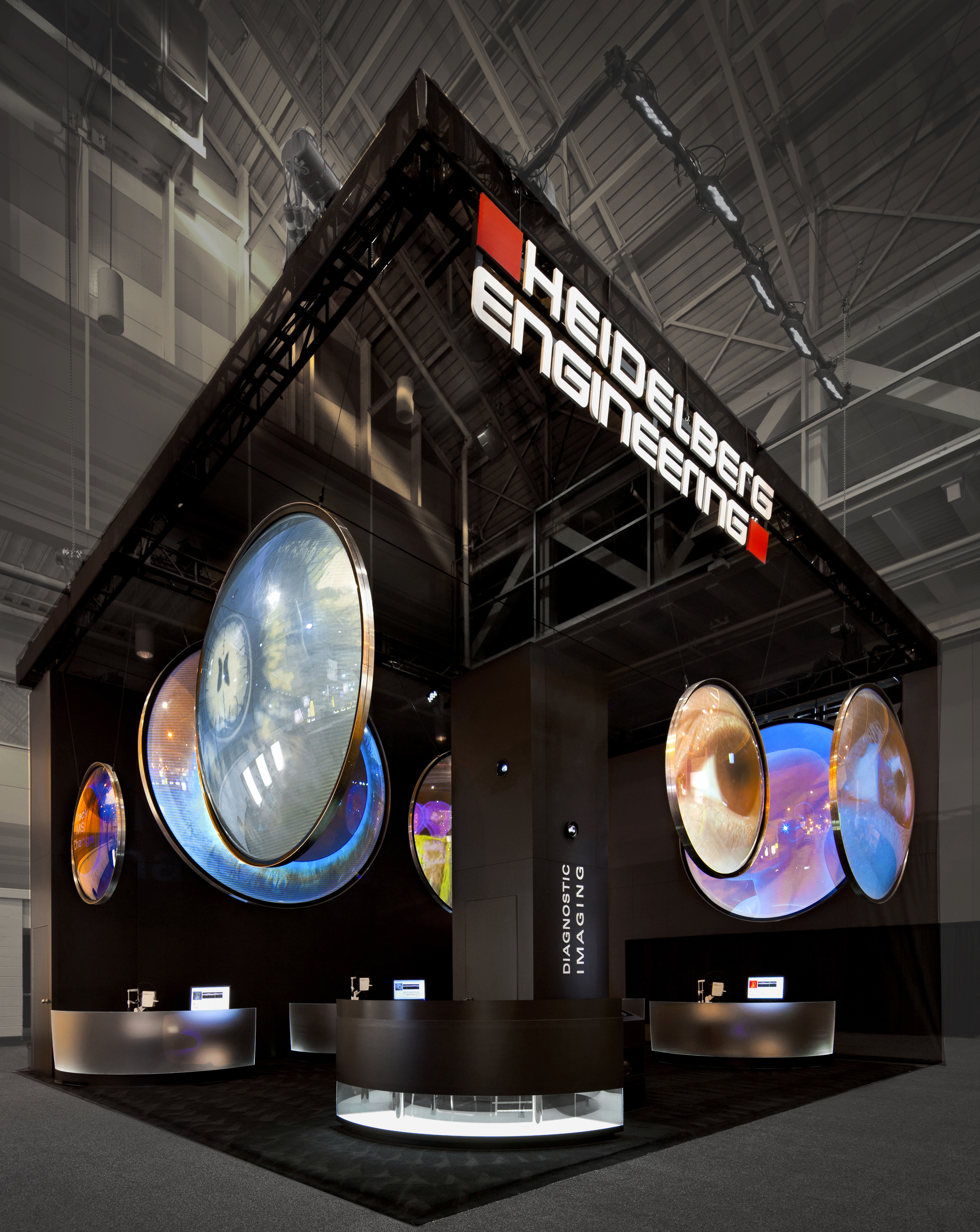
The guidance for a black exhibits is different because the color black absorbs so much light. Lighting an entire black exhibit uses so much light, that it often becomes impractical. It works best when used as an unilluminated backdrop for small illuminated features ( such as type, photos, video screens, etc.). This lets the illuminated features pop against a dramatic dark background. 

Heidleberg Engineering Exhibit

Heidleberg Engineering Exhibit

Multiple colors require more restraint because they can overpower the message. Again if yo u are making a color statement, let the message guide the design. In this case, the variety of colors reinforced the message of unique approaches to HR management.

McDonald’s World Wide Conference-People Exhibit

McDonald’s World Wide Conference-People Exhibit

The most powerful way to use color is to be thorough in the use of color. Let the color be the star or a background of a single message to draw your customers in. 

I look forward to your comments.                           

tags: exhibit lighting, glowing exhibit, future exhibit, natural exhibit, environmental exhibit, McDonald's, exhibit color, award winning exhibit designer, award winning trade show exhibits, award winning booth
Wednesday 06.05.19
Posted by mitchell mauk
 

Standing Out With a Small Exhibit Booth

You’ve got your inline exhibit assembled next to a zillion other exhibits, hoping to attract attendee’s attention. What can you do to get noticed by potential customers? Start by ruthlessly distilling the message. 

D-Wave 10x10 Exhibit.jpg

Often a client will bring a PowerPoint for the concept. On the show floor, you have about 3 seconds be noticed, and this just isn’t the place for a wall of selling points. Bullet points don’t work because attendees don’t read at trade shows. They just don’t. Their judgments are based more on “how does this experience feel?”. A single succinct marketing message is simply the best in any promotional situation.  

For a 10x10 exhibit, one message is optimal. A 10x20 can accommodate up to two messages while maintaining “stop in your tracks” clarity. Anything more, and your messages turn to marketing mush inside the attendee’s mindspace.

Light is the most neglected piece of a small exhibit. A brightly lit exhibit makes all your surrounding neighbors look dull. Light should highlight the message or featured product. Rear or halo lit letters bring a premium look to any exhibit. A fully lit backwall with a simple message is a great start. 

IMG_5425.jpg

Color is another underutilized element. Big, bold color can punch through the visual anarchy on the trade show floor. Selling a green product? Make the whole exhibit bright green. Think beyond the backwall. Carpet, table, lights (green colored gels) and even the furniture. An exhibit that looks like it’s been dipped in color will increase attention.

Small inline exhibits can have unique advantages over larger exhibits. Smaller budgets allow companies to cast a wider net, and test shows in non-traditional markets. They are also more flexible and fit into most shows without the heavy customization needed for larger island exhibits.

Sugar Bowl Bakery 10x20 Exhibit.jpg

Finally, with the uniformity of fabric-based exhibits, your exhibit needs good design even more to separate your message out from your competitors surrounding exhibits. Promoting a unique product in a sea of look-alike inline exhibits works against your message, so really focus on the design to stand out. 

Having designed award winning small exhibits, the key to your success is distill the message, light it really well, and have a really great design.

I look forward to your comments.

MM                          

tags: trade show exhibit, tradeshow booth, small exhibit, award winning exhibits, award winning exhibit designer, inline exhibit booth
Wednesday 05.08.19
Posted by mitchell mauk